The Checkout Button Is Designed Against You. Here's the Fix.
The orange "Add to Cart" button. The green "Complete Purchase." The pulsing "Buy Now." These aren't random design choices. They are the output of billions of dollars in conversion rate optimization, A/B testing, and behavioral research - all aimed at one goal: getting you to click before your rational brain can object.
Here's how it works, and what you can do about it.
Why checkout buttons are orange and green
Amazon's "Add to Cart" button has been orange for over a decade. Shopify's default checkout theme uses green. This isn't coincidence or aesthetic preference - it's the result of massive A/B testing on real users.
Orange triggers urgency and calls to action. Green signals "go." Both are high-contrast against white backgrounds, making them visually dominant on a busy product page. Every color, every font size, every pixel of button placement has been tested against millions of real sessions.
The friction-removal pipeline
In the early days of e-commerce, checkout required 7 or 8 steps. Today's average Shopify checkout is 3 steps. Amazon offers one-click checkout on most items. Apple Pay and Google Pay complete a purchase with a fingerprint scan.
Every one of these changes was driven by data showing that friction - any step that requires a decision - reduces conversions. The "Is this card correct?" screen that used to appear before payment confirmation? Removed. The order summary page you had to scroll through? Collapsed by default. The separate shipping address form? Auto-filled.
The goal is to minimize the time between desire and payment confirmation. Your reflection time is their enemy.
Countdown timers and stock warnings
You've seen these: "Only 2 left in stock." "17 people have this in their cart." "This deal expires in 01:23:44."
These are dark patterns - UX manipulations designed to trigger loss aversion, which behavioral economics research consistently identifies as a more powerful motivator than the equivalent positive gain. Losing $20 hurts more than gaining $20 feels good. Platforms exploit this directly.
The important thing to know: most of these signals are dynamic and manufactured.
- Countdown timers commonly reset when you reload the page
- Stock counts are algorithmically managed to appear low without necessarily reflecting real inventory
- "People viewing this" figures are often approximate or estimated, not real-time user counts
Express checkout is the final boss
Amazon's "Buy Now" button, Shopify's Shop Pay, Apple Pay, PayPal's "Pay in 4" - these all share a design goal: bypass the cart entirely.
The cart used to be the last natural point of reflection. You'd see everything you'd added, the total price, the shipping cost, and make a final decision. Express checkout removes this entirely. You go from product page to confirmed purchase in two clicks, with no intermediate review.
This isn't a convenience feature. It's the deliberate elimination of the moment where you might change your mind.
How to add friction back
The counter-strategy is deliberate friction. These aren't hacks - they're structural changes that work without requiring willpower in the moment:
- Disable one-click ordering: In Amazon account settings, you can turn off 1-Click. Checkout will require an extra confirmation step.
- Remove saved payment methods: From your browser, Amazon account, and any shopping apps. Typing your card number takes 30 seconds and gives you 30 seconds to think.
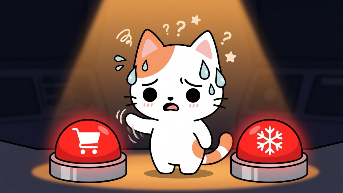
- Use a checkout pause extension: Cart Freeze reinserts a pause before checkout buttons fire. You can always continue - it just gives you the moment of reflection that express checkout removed.
- Disable push notifications from shopping apps: Every "Sale starts now!" notification is a manufactured trigger sent at scale.
You're not fighting a website
You're fighting a system built by thousands of engineers whose job is to prevent exactly the moment of pause that would let you make a different decision. Every UX optimization on a major retail site has been tested against real user behavior and validated by conversion data.
The good news: the same way retailers use systems to get you to buy, you can use systems to create the space to not buy. It doesn't require effort in the moment. It requires setting up the friction once.
Give the pause back to your checkout. Works on Amazon, eBay, Walmart, Etsy, Shopify and 500+ more.
 Add Cart Freeze - Free